
Key takeaways
Style the code with brand colors, a centered logo, rounded modules and a call-to-action frame, but keep dark modules on a clearly lighter background. Leave the quiet zone (the blank margin) around the code untouched, and keep the three corner markers recognizable. Choose the error-correction level and print size for the real setting, then test the final file on at least one iPhone and one Android phone. Use a dynamic code for anything printed or long-lived, so you can change the destination without redesigning or reprinting.
A branded QR code is a standard QR code restyled with your colors, logo, shape and call to action, so it looks like part of your brand and still decodes on any phone. The rule that decides every design choice is simple: change what the eye sees, never what the camera needs. Keep strong contrast, a clear margin, intact corner markers and a size that suits the scanning distance, then test the exact file you plan to print. This guide walks through each element you can style, the limits of each, and how to keep the destination editable after the design is locked.
What branded QR code design actually involves#
Branding a QR code means making three things consistent: how the code looks, where it leads, and what the person is promised before scanning. Most guides stop at the first one. A logo in the middle of a black square is a start, but a scan that lands on a generic or mismatched page undoes the effort.
In practice, branded QR design has four layers:
- Visual style. Colors, module shapes, corner shapes, logo and background.
- Context. A frame, a short call to action and a clear reason to scan, placed next to the code.
- Destination. A landing page that carries the same look, tone and offer as the material the code sits on.
- Trust. A link that looks and behaves like it belongs to you, ideally on your own domain rather than a generic third-party address. Our guide on creating a QR code with your own domain covers the setup.
The first layer is where design choices can hurt reliability, so most of this article concentrates there. If you want a broader view of the process from design to tracking, see our piece on branded QR codes.
How a QR code works, and why that limits styling#
A phone camera does three jobs: it finds the code, reads the pattern of dark and light squares (called modules), and corrects errors using redundancy built into the symbol. Every styling choice interferes with one of those jobs.
- Finding the code relies on the three large corner markers and the empty margin around the symbol.
- Reading the modules relies on contrast between dark and light areas and on modules being large enough to resolve.
- Correcting errors relies on the error-correction level you selected, which is the spare capacity a logo or a scuff will use up.
The international standard for the symbology, ISO/IEC 18004[1], defines the symbol structure, the quiet zone and the error-correction levels. Designers do not need to read it cover to cover, but it explains why some stylings work and others fail: the structure is fixed, and the look has to be fitted around it.
Design elements you can customize#
Colors#
Color is the easiest and most visible way to brand a code. Scanners read brightness difference, not hue, so what matters is how much darker the modules are than the background.
- Use a dark foreground on a light background. Deep navy, forest green, charcoal or a dark brand red all work well on white or a pale tint.
- Avoid light brand colors for the modules. Yellow, light orange, pastel pink and light gray on white lose contrast fast, especially under store lighting or on glossy paper.
- Be careful with inverted codes. Light modules on a dark background are more likely to fail on some scanning apps, because the symbology assumes dark on light.
- Gradients are fine if the lightest part is still dark enough. Check the weakest corner of the gradient, not the average.
For retail packaging, GS1, the standards body behind product barcodes, notes in its 2D barcode colour and quality guide[2] that low contrast, reflective materials and alterations to the pattern can impair scanning. If a code will sit on a product, check that guide before settling on a palette.
If you are still deciding which brand colors should lead, the psychology of colors in marketing can help you choose a hue that carries the right feeling; then adjust its darkness until the code scans cleanly.
Module and corner shapes#
Modern generators let you swap square modules for dots, rounded squares or tiny diamonds, and change the corner markers into rounded or leaf-like forms. These are safe in moderation:
- Rounded squares and dots look softer and often match modern brand identities.
- Keep modules close enough together that the code still reads as a clear grid. Very small dots with large gaps reduce the amount of dark area the camera sees.
- Keep the three corner markers recognizable as nested shapes with a distinct center. Rounding them is fine; turning them into abstract artwork is not.
The more unusual the shape, the more important it is to test on older phones and in low light.
Logos#
A logo in the center is the most common branding device, and the most commonly overdone. It works because QR codes carry redundancy: a small area can be covered and the data is still recovered.
Good practice:
- Keep the logo small and centered, and give it a plain light background so it does not blend with the modules around it.
- Never cover or crowd the corner markers, or the smaller alignment and timing patterns that help the camera orient itself.
- Raise the error-correction level before adding the logo, not after. A higher level makes the code denser, so check that the modules are still large enough at your print size.
- Decode the exact exported file after the logo is applied. A design that looked fine on screen can fail once exported.
GS1 specifically warns that logos and pattern alterations can reduce barcode quality, so treat the logo as a cost to be budgeted, not a free decoration.
Backgrounds and artistic styles#
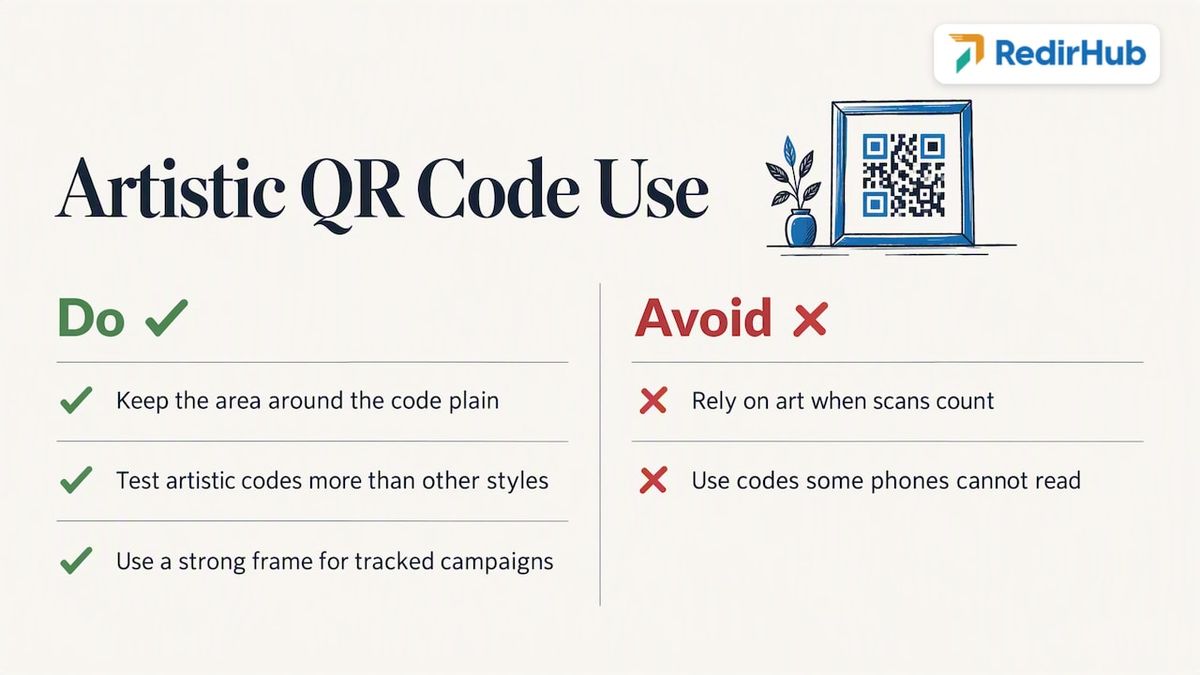
Artistic QR codes blend the symbol into an illustration or photograph. They can stand out, but they carry the highest failure risk. If you use one, keep the area around the code plain enough that the camera can separate it from the picture, and test it more than any other style. For a tracked campaign where every scan counts, a cleaner design with a strong frame usually earns more scans than a clever one that some phones cannot read.
Frames and calls to action#
The cheapest improvement to any code is a short instruction beside it. A frame with words such as “Scan to see the menu” or “Scan for 10% off” tells people why to scan and that scanning is expected. Place the text outside the quiet zone, never inside it. State a specific benefit rather than the word “scan” alone, and keep the wording consistent with the page the scan lands on.
Protect scannability: contrast, quiet zone and error correction#
Three technical settings decide whether a styled code survives the real world.
Contrast#
Aim for a dark, saturated foreground and a clearly lighter background. If you cannot tell the code apart from its surroundings in a grayscale copy of your design, a camera will struggle too. A quick check: convert your artwork to black and white and see whether the modules still stand out sharply.
Quiet zone#
The quiet zone is the blank border around the code. The standard specifies one, and the common guidance is four modules of empty space on every side. Do not let borders, patterns, photo edges, text or a cropped corner enter that margin. Designers often trim this space to make a code fit a layout, and it is one of the most frequent causes of codes that scan on a screen and fail on paper.
Error correction#
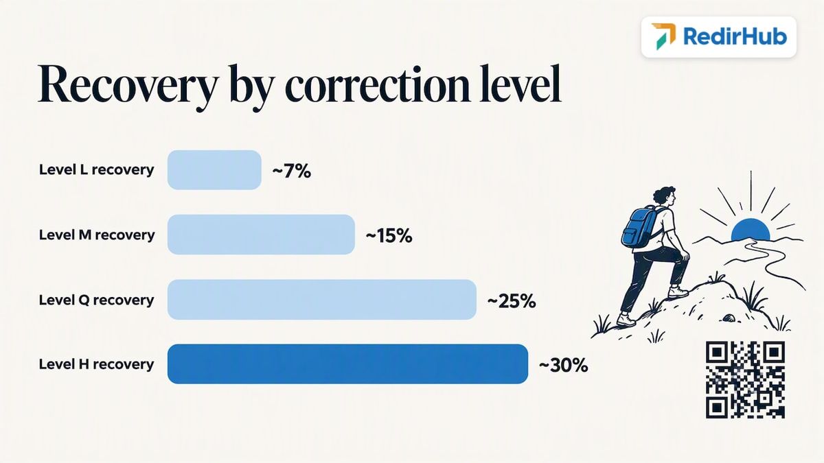
QR codes have four error-correction levels, L, M, Q and H, which recover roughly 7%, 15%, 25% and 30% of the symbol if part of it is damaged or hidden, as set out in the ISO/IEC 18004 specification[1]. Higher levels give a logo or a scratch more room, but they add modules, which makes each module smaller at a given print size.
A practical way to choose:
| Situation | Sensible starting point |
|---|---|
| Clean screen display, no logo | Level M |
| Printed material with a small center logo | Level Q or H |
| Outdoor, packaging or surfaces likely to scuff | Level H, tested on the real material |
| Very long destination address | Shorten the encoded address first, then pick the level |
That last row matters. The less data the code carries, the fewer and larger its modules. Encoding a short address, which a link-management platform makes easy, gives your design more room to breathe.
Adapt the design for print and screen#
Print#
Print is less forgiving than a screen. Ink spreads, paper absorbs, laminates reflect and folds cut through modules.
- Use vector files (SVG or EPS) for anything printed. Scaling a small PNG blurs the module edges.
- Mind the module size. For stable scanning of two-dimensional symbols on retail products, GS1 Japan’s verification project recommends a module width of at least 0.495 mm[3]. That is a floor for product packaging, not a size target for posters.
- Scale up with distance. A rough rule of thumb is that the code width should be about one-tenth of the scanning distance, so a code meant for scanning from one meter away should be around 10 cm wide. Treat that as a starting estimate and confirm it with a real test.
- Avoid glossy or curved surfaces where glare or distortion can hide modules. Matte stock helps.
- Keep codes away from folds, seams and perforations.
For mailers and printed inserts, the extra considerations of paper stock and trust are covered in our guide to direct mail QR codes.
Screen and digital#
On screens, the code needs enough pixel resolution to keep modules crisp, and it needs to display against a solid light area, not over a moving video background. On a slide or a video, leave it on screen long enough to scan. In email, remember that many readers will open the message on the same phone that would scan the code, so a tappable link is better than a code there.
Test before you publish#
Testing is the step most teams skip, and the one that prevents a costly reprint. Test the final file on the final material, not a screenshot of the design.
- Use more than one device. At minimum, one recent iPhone and one Android phone, plus an older model if your audience is broad.
- Use more than one scanner. Try the native camera app and a scanning app, since they behave differently.
- Vary the conditions. Scan at the real distance, from an angle, in dim light and in bright light or direct sun.
- Scan repeatedly. One successful scan proves little. Several clean scans in a row on each device is a better signal.
- Check the destination. Confirm the phone opens the right page, on mobile, with the right language and the right tracking.
- Keep a short record. Note the device, the app, the conditions and the result, so you can repeat the test whenever the design changes.
For retail packaging, GS1 also publishes quality grades. Its guide states a minimum grade for two-dimensional barcodes in retail applications of 1.5/12/660[2], which a verifier measures. Most marketing teams will not need a verifier, but packaging teams working to retail standards might.
Static or dynamic: decide before you design#
Before finalizing the look, decide where the code will point and for how long. This is a design decision, not just a technical one, because it affects how dense the symbol is and whether it can ever be changed.
- A static code stores the destination directly inside the pattern. It is free of dependencies, but the destination can never change, and a long address makes a dense, harder-to-style symbol.
- A dynamic code stores a short link that redirects to the destination. The pattern is simpler, and you can change where it leads at any time, with no reprint. You also get scan analytics.
Use static for something permanent and trivial, such as a Wi-Fi login that will never change. Use dynamic for anything printed, anything on packaging or signage, anything that runs more than one campaign, and anything where you want to know how many people scanned. Our comparison of static vs dynamic QR codes goes deeper, and our overview of QR code tracking shows what you can measure without reprinting.
The design implication is simple: a dynamic code lets you invest in one polished visual identity and reuse it for years, while the destination evolves behind it. A branded code on a brand domain also looks more trustworthy when the link preview appears. For more on this, see our QR code security checklist.
A dynamic code adds one redirect between the scan and your page, so its speed is part of the experience. Over 2026-10-27 to 2026-11-03, the median time to first byte of RedirHub redirects was 15 ms, measured from Washington, D.C., Frankfurt and Tokyo; across the 27 providers in the same test it ranged from 9 ms to 586 ms (RedirHub redirect speed benchmark[4]).
A repeatable workflow for a branded code#
- Define the goal, the audience and the one action you want after the scan.
- Choose the destination and decide static or dynamic. Shorten the encoded link.
- Pick brand colors with a dark foreground and light background.
- Choose module and corner shapes that match your identity without hiding the structure.
- Add a small centered logo only if it adds value, and raise error correction to match.
- Add a frame and a specific call to action outside the quiet zone.
- Export as a vector file at the print size.
- Test on devices, apps and materials, then fix and retest.
- Publish, track scans and review the results. Ideas for what works are in our roundup of QR code campaigns that earn scans.
Common mistakes to avoid#
- Shrinking the quiet zone to fit a layout.
- Using a pale brand color for the modules.
- Placing a logo that is too large, or one that touches the corner markers.
- Skipping the test on the final printed material.
- Printing a static code for a campaign that may need changes.
- Sending scanners to a desktop page that is hard to use on a phone.
- Using a generic link domain that does not match the brand.
Our perspective#
That is why we treat QR design and link management as one job. At RedirHub, we build dynamic codes on your own domain, so the pattern you approve stays the same while the destination stays under your control. Your brand shows in the code, in the link and in the page it opens.
Our advice is to design for the camera first and the eye second, test the final file on real devices, and keep the destination editable. A code that scans every time and can be redirected next quarter is worth more than a clever pattern you must reprint.
Make your branded codes last#
If your codes will appear on print, packaging or signage, RedirHub’s dynamic QR codes let you keep the design fixed and change the destination whenever the campaign changes, with scan analytics and SSL on your own domain.
Plans start with Core at $49 per month and Pro at $119 per month, and Enterprise is set by contract. Pro comes with a 14-day free trial; Core starts right away. See the details on the pricing page, or learn how our branded short links keep every channel on your domain.
Dynamic QR codes on your own domain
Keep the design you approved and change the destination whenever a campaign changes, with scan analytics and automatic HTTPS. Pro comes with a 14-day free trial; Core starts right away.
See dynamic QR codesSources
Frequently asked questions
Keep it small and centered, well clear of the three corner markers. There is no universal percentage that is safe, because the limit depends on the error-correction level, the amount of data and the print size. Raise the error-correction level, then decode the exact exported file on several phones to confirm.
You can use almost any hue, as long as the modules are much darker than the background. Light yellows, pastels and light grays on white tend to fail. Inverted codes with light modules on a dark background also fail on some scanners, so test them on several devices before printing.
Not with a dynamic code. The printed pattern points to a short link you control, and you change the destination behind it. With a static code, the destination is part of the pattern, so any change means a new design and a new print run.
Test the final exported file on the real material, at the real distance and in different lighting, using at least one iPhone and one Android phone. Check that the right page opens each time. Fix any failure by increasing contrast, simplifying the style or enlarging the code.

Leo Astarothman is the Brand & Content Lead at RedirHub, where he shapes the company's visual identity, educational content, product experiences, and marketing strategies. He also specializes in system design. Simplifying complex redirect infrastructure into practical resources, product experiences, and campaigns that help businesses understand and adopt modern redirect management.
Related Articles
View All Articles