

Key takeaways
Export print codes as SVG or PDF (vector), not a small PNG, so edges stay sharp at any size. Use dark modules on a light background. GS1 asks for a symbol contrast of at least 30%, recommends around 50%, and names black and white as the ideal pair. Test a proof on the real paper or material, with the real printer, and with several phones, before approving a full run. Use a dynamic code when the code will be printed in volume, so you can change the destination without reprinting. Keep the quiet zone (the blank margin) clear and never crowd the code with text, folds or glare.
A QR code for print works when it is exported as a vector file, printed large enough with strong contrast, tested on the real material, and pointed at a link you can still change after the ink is dry. Get those four things right and a flyer, mailer, package or poster scans on the first try. Miss one and you pay for it in reprints.
This guide walks through each step in the order you will meet them: choosing a generator, picking a file format, setting size and color, placing the code, testing a proof, and deciding between static and dynamic codes.
What a print-ready QR code actually needs#
A QR code on a screen is forgiving. A QR code on paper, vinyl, cardboard or a menu table is not. Ink spreads, glossy coatings reflect light, folds cut through modules, and people scan from odd angles in bad lighting. “Print-ready” is shorthand for a code that survives all of that.
When you evaluate a generator for print work, look for these capabilities:
- Vector export (SVG, PDF, EPS). Raster files such as PNG or JPG are fine for screens, but a low-resolution PNG stretched onto a banner blurs at the edges and scans poorly.
- Error correction control. Higher levels let a code survive scuffs and a small logo, at the cost of a denser pattern.
- Color control with contrast feedback. Brand colors are fine only if the dark and light values remain clearly separated.
- A dynamic option. The code points to a short link you control, so the destination can change after printing.
- Scan analytics. You want to know which flyer, store or mailer drove the visit, by scan count, location and device.
- SSL and a domain you own. A code that resolves to a generic third-party domain can look suspicious, and it ties your printed material to someone else’s infrastructure.
Many free tools hand you a static code and a PNG, then stop. That is enough for a one-off sticker. It is not enough for a catalog, a packaging run or a direct mail campaign.
Step by step: creating a QR code for print#
- Decide what the code should do. One destination, one action. A product page, a menu, a sign-up form, a coupon. Vague destinations produce vague results.
- Choose the destination URL. Send mobile users to a page that loads fast and works on a phone. A desktop-only PDF defeats the purpose.
- Pick static or dynamic. More on this below. For anything printed in quantity, choose dynamic.
- Customize the design. Set colors, an optional logo, and a frame with a short call to action such as “Scan to see the menu.”
- Export as SVG or PDF. Keep a high-resolution PNG only as a backup for software that cannot place vectors.
- Place it in your layout at the size and position described in the sections below.
- Print a proof and test it. Never skip this. The testing section explains how.
- Approve the run only after the proof scans on every device you tried.
That sequence is the same whether you are making a business card, a trade show banner or ten thousand direct mail pieces. The only thing that changes is how expensive a mistake becomes.
File formats: why vector wins#
A QR code is a grid of squares. In a vector file (SVG, PDF, EPS), those squares are defined as shapes, so they stay perfectly crisp whether the code is printed on a business card or a billboard. In a raster file (PNG, JPG), the squares are pixels. Enlarge the file and the edges soften, and soft edges are what make scanners fail.
Practical rules:
- Use SVG when your designer works in vector software, or when a web-to-print vendor accepts it.
- Use PDF when you are handing off a finished layout to a printer.
- Use PNG only for documents, slides or small digital uses. If you must use it for print, export it at a very high resolution and never scale it up afterward.
- Avoid JPG for QR codes. Compression adds noise around module edges.
One trap worth knowing: importing a QR vector into layout software and exporting to PDF can sometimes produce a missing background or a clipping mask problem, as designers have reported in Adobe community discussions[1]. Clean up the artwork after import, then scan the exported PDF itself, not the original file. Test what the printer will receive.
Contrast and color: the rule that causes most failures#
Scanners read the difference between dark and light modules. If that difference shrinks, reads fail. The GS1 2D Barcode Colour & Quality Guide[2] asks for a symbol contrast of at least 30% to reach the minimum quality grade, recommends around 50% for greater reliability, and names black and white as the ideal colours.
What that means when you design:
- Dark code on a light background. Navy, dark green or charcoal on white or cream all work.
- Avoid light-on-dark inversions unless you have tested them on several phones. Some scanners handle them and others do not.
- Avoid red for codes read by retail scanners. The same GS1 guide warns that point-of-sale scanners operating at 660 nanometers cannot detect red. If your code sits on a product that may pass through a checkout, keep it out of the red range.
- Beware of gradients and photo backgrounds. If the background behind the quiet zone varies, the scanner may misjudge where the code begins.
- Check coated stock. Gloss and foil can reflect light and wash out a code in certain lighting. Matte finishes are safer for codes.
Brand teams often want the code to match a palette. That is reasonable, and it is a design problem you can solve by darkening the code color rather than lightening the background. The same rules hold for recruitment posters and job-fair material; for where those codes go and what they should open, see this piece on QR codes in recruitment[3].
For a deeper look at designing within brand rules, see our guide to branded QR codes and how to test them.
Size and quiet zone#
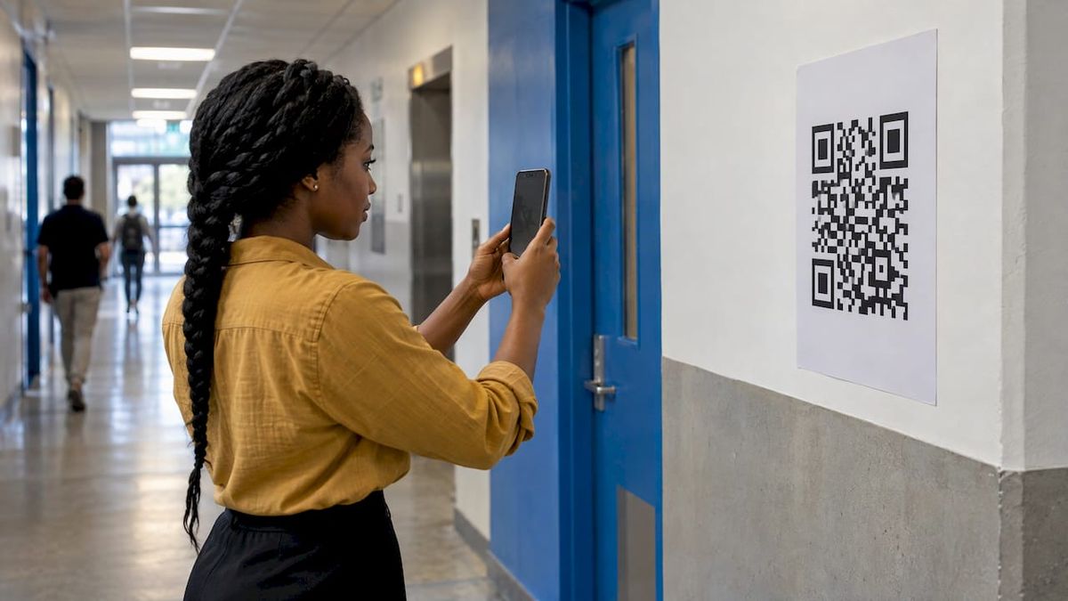
Bigger is safer. The right size depends on how far the reader will stand and how dense the code is. A code that holds a long URL has many small modules, so it needs more space than a code holding a short link. This is one of the practical reasons to encode a short branded link rather than a long tracking URL: fewer modules means each one prints larger at any given size.
The measurable evidence here comes from GS1 Japan’s 2025 verification project on printed 2D symbols. Its tested symbols achieved better print-quality results at an X-dimension (the width of a single module) of 0.495 mm or above[4], while the tested 0.250 mm symbols performed poorly. You do not need to measure modules by hand. The takeaway is simple: if your layout forces the code very small, the module size shrinks with it, and print quality becomes the limiting factor.
Sizing habits that hold up:
- Start with the largest area your layout can spare and work down, not the reverse.
- Keep a clear blank margin all around the code, the quiet zone. Do not let text, borders or images creep into it.
- Shorten the encoded link. A short branded link produces a simpler pattern than a long URL with parameters.
- Treat business cards and small stickers as the hardest case. Test those more than anything else.
Where to place the code#
Placement is a usability decision as much as a design one.
- Flat, reachable surfaces. Avoid placing a code over a fold, a staple, a perforation or the spine of a booklet.
- Eye level and arm’s reach. A code on a poster hung high above the crowd will not be scanned. Put it where people can aim a phone comfortably.
- Next to a reason. A code with no context gets ignored. Add a short line saying what the person gets: a discount, a menu, a manual, a video.
- Away from glare. Window displays and glossy packaging reflect light. Shift the code or choose a matte finish.
- One code per surface. Two codes side by side confuse people and scanners.
Different formats have different habits. On packaging, the code often sits on a back or side panel with room for a quiet zone. On direct mail, it works best near the call to action and on the side where the recipient’s attention lands. We cover that format in detail in direct mail QR codes: how to print, track and trust them. For ideas on what to put behind the code, see these QR code campaigns that earn every scan.
Static or dynamic: the decision that matters most after printing#
A static QR code stores the destination directly in the pattern. It cannot be edited. If the URL changes, the code is wrong, and the only fix is a new code on new material.
A dynamic QR code stores a short link that you control. That link redirects to your destination, and you can change the destination at any time. The printed pattern never changes.
| Static code | Dynamic code | |
|---|---|---|
| Destination editable after printing | No | Yes |
| Scan analytics | Usually none | Scans by time, location and device |
| Pattern density | Grows with URL length | Stays compact (short link) |
| Best for | One-off personal use, short-lived items | Campaigns, packaging, direct mail, signage, anything printed in volume |
| Risk if the page moves | Reprint | Update the link |
The cost of a wrong static code scales with print volume. A typo on a hundred stickers is an annoyance. A broken landing page on fifty thousand mailers is a budget line. Dynamic codes turn that risk into a two-minute edit. We walk through the mechanics in how to change a QR code destination after printing.
How long the extra redirect takes#
A dynamic code adds one redirect between the scan and the page, so the speed of that hop is part of what the person holding the phone waits for. In RedirHub’s redirect speed benchmark[5] for 27 October to 3 November 2026, the median time to first byte of a redirect, averaged over Washington, D.C., Frankfurt and Tokyo, ran from 9 ms (Amazon CloudFront) to 586 ms (Apache) across 27 providers. Link and QR code services spread across most of that range:
| Service | Median time to first byte |
|---|---|
| RedirHub | 15 ms |
| Dub | 38 ms |
| Short.io | 55 ms |
| TinyURL | 93 ms |
| Bitly | 115 ms |
| Cuttly | 229 ms |
| Rebrandly | 267 ms |
| BL.INK | 512 ms |
The hop comes on top of the landing page’s own load time, which is why the testing routine below opens the destination on mobile data, not only on Wi-Fi.
Testing before you print the full run#
Most QR failures show up quickly once someone actually tests. Follow this routine:
- Scan the digital file on screen first, to confirm the destination is right.
- Print a proof on the real stock with the real printer or press, the same coating and the same ink. GS1 Japan’s project recommends testing with the intended printer, material and operating conditions, and that advice applies to every print job, not just retail packaging.
- Scan with at least three phones, including an older model and both iOS and Android camera apps.
- Scan in different light. Office light, daylight, dim light, and under any glare your placement will face.
- Scan at realistic distance and angle. Hold the proof where a customer would.
- Open the destination on mobile data, not just Wi-Fi, and confirm it loads quickly.
- Check the exported PDF, not only the design file.
- Get a second person who has not seen the project to try it.
If anything fails, fix the cause rather than retrying: enlarge the code, raise contrast, shorten the link, or change the finish. Then proof again.
Common mistakes#
- Exporting a tiny PNG and stretching it to fit.
- Putting a logo so large that error correction cannot recover the hidden modules.
- Choosing brand colors with weak contrast.
- Printing a code over a fold or a seam.
- Sending scanners to a desktop page or a slow PDF.
- Forgetting to tell people why they should scan.
- Printing static codes in volume with no way to fix them.
- Encoding a link on a domain or service you do not control, then losing it.
Security belongs on this list too. A printed code can be covered by a malicious sticker, and people cannot tell a safe code from an unsafe one by looking. Use a recognizable branded domain and inspect printed placements in public spaces. Our QR code security checklist covers the risks and defenses.
Our perspective#
Print is permanent and URLs are not. Campaign pages get retired, products get renamed, sites get migrated, and agencies change. When the code points straight at a destination, every one of those events turns printed material into a dead end. When the code points at a short link on your own domain, the printed code stays valid for as long as you keep the domain.
That is why we built RedirHub around your own domain rather than a shared shortener. The link carries your brand, runs over SSL, and can be repointed whenever the destination changes. Analytics show which printed piece is performing, so the next run is designed with data rather than guesses.
Our advice to marketers is simple: treat the QR code as a permanent asset and the destination as a variable. Design the code once, test it carefully, and keep control of what it resolves to.
Keeping printed codes working for years#
Printed material outlives campaigns. A menu, a product label or a trade show banner may stay in circulation long after the team that made it has moved on. Plan for that from the start.
- Own the domain. Use a branded domain you control, so the code never depends on a third party’s shared domain.
- Track scans. A code that nobody measures cannot be improved. Read our guide to tracking QR code scans without reprinting, or the fuller QR analytics and tracking guide.
- Document where each code lives. Keep a simple register: code name, short link, where it was printed, run size and owner.
- Redirect, don’t replace. When a campaign ends, point the code at a relevant evergreen page instead of letting it dead-end.
- Revisit migrations. If your website is restructured, make sure printed short links still resolve.
For teams running many codes across brands, personalization matters too. See how to design, brand and track personalized QR codes.
Choosing a QR code generator for print campaigns#
A short checklist for marketers and agencies comparing tools:
| Question | What a good answer looks like |
|---|---|
| Can I export vector files? | SVG or PDF, at no extra cost |
| Can I change the destination later? | Yes, without changing the printed code |
| Does the link use my domain? | Yes, with SSL handled for me |
| Can I see scans by campaign? | Yes, broken down by time, place and device |
| Can I manage many codes at once? | Bulk creation and editing |
| Is there team access control? | Roles and, for larger organizations, single sign-on |
| What happens if I stop paying? | Know in advance whether printed codes keep resolving |
That last row deserves attention. A code that stops working when a subscription lapses is a hidden liability for anything printed. Ask the question before you print, not after. On RedirHub, when a plan ends, the links it no longer covers are paused, not deleted, and redirect again on their own as soon as a plan covers them; the dashboard warns 14 days before a plan ends. More on this in do QR codes expire?.
Putting your own domain behind every printed code#
If you are printing codes in volume, RedirHub’s dynamic QR codes let you create codes on your own domain, change the destination after printing, and track scans with analytics. They are included on Core, Pro and Enterprise and download as PNG (512, 1024 or 2048 px) or SVG, so the vector file your printer needs comes straight from the dashboard. Links run over SSL, and you can pair QR codes with branded links and domain redirects for the rest of your campaign.
Plans are published on the pricing page: Core is $49 per month and Pro is $119 per month, and Enterprise is set by contract. Pro comes with a 14-day free trial; Core starts right away, without a trial. Pro also offers add-ons: Single Sign-On at $200 per month, Custom Name Servers at $100 per month and a Dedicated Cluster at $300 per month. If you are moving a site and have printed codes in circulation, our website migration service helps keep old links resolving.
Print once, change the destination any time
Create dynamic QR codes on your own domain, download them as SVG for the printer, and change where they lead after the run is printed.
Create a dynamic QR codeSources
- [1]Adobe community: QR codes not working once exported from Illustrator to PDF
- [2]GS1 2D Barcode Colour & Quality Guide (2025)
- [3]Filmijob: Reclutamiento con códigos QR: cuándo funciona y cómo implementarlo
- [4]GS1 Japan: 2D Symbol Printing and Reading Verification Project (2025)
- [5]RedirHub redirect speed benchmark, 27 October to 3 November 2026
Frequently asked questions
Export it as SVG or PDF, keep strong dark-on-light contrast, leave a clear margin around it, and print it large enough for the distance it will be scanned from. Then print a proof on the real material and scan it with several phones before approving the full run.
Vector formats such as SVG and PDF are best because the modules stay sharp at any size. Use PNG only for small or digital uses, and avoid JPG because compression blurs the edges. Always scan the final exported file, not just the original design.
Only if it is a dynamic code. A static code carries the destination in its pattern, so a new URL means a new code. A dynamic code points to a short link you control, so you can update the destination without touching the printed material.
Any dark color on a light background works if the contrast is strong. GS1 guidance asks for at least 30% symbol contrast and recommends around 50%, with black and white as the ideal pair. Avoid red on products that may be read by retail scanners, and test brand colors on several phones.

Leo Astarothman is the Brand & Content Lead at RedirHub, where he shapes the company's visual identity, educational content, product experiences, and marketing strategies. He also specializes in system design. Simplifying complex redirect infrastructure into practical resources, product experiences, and campaigns that help businesses understand and adopt modern redirect management.
Related Articles
View All Articles