
Key takeaways
Name the result, not the action: "Scan to view the menu" gives a reason that "scan here" never does. Put the code where the need arises and close enough to its own instruction. Send the scan straight to the promised page, not a homepage. Give each placement its own tracking path and measure the finished task, not only scans. Keep the address on a domain you control and the destination editable, and plan what an expired offer will open.
You're reviewing a poster, receipt, or packaging proof, and the QR code is already in place. It scans correctly. But the text beside it says nothing more useful than scan here, leaving the customer to guess whether they'll find a discount, a registration form, or your homepage.
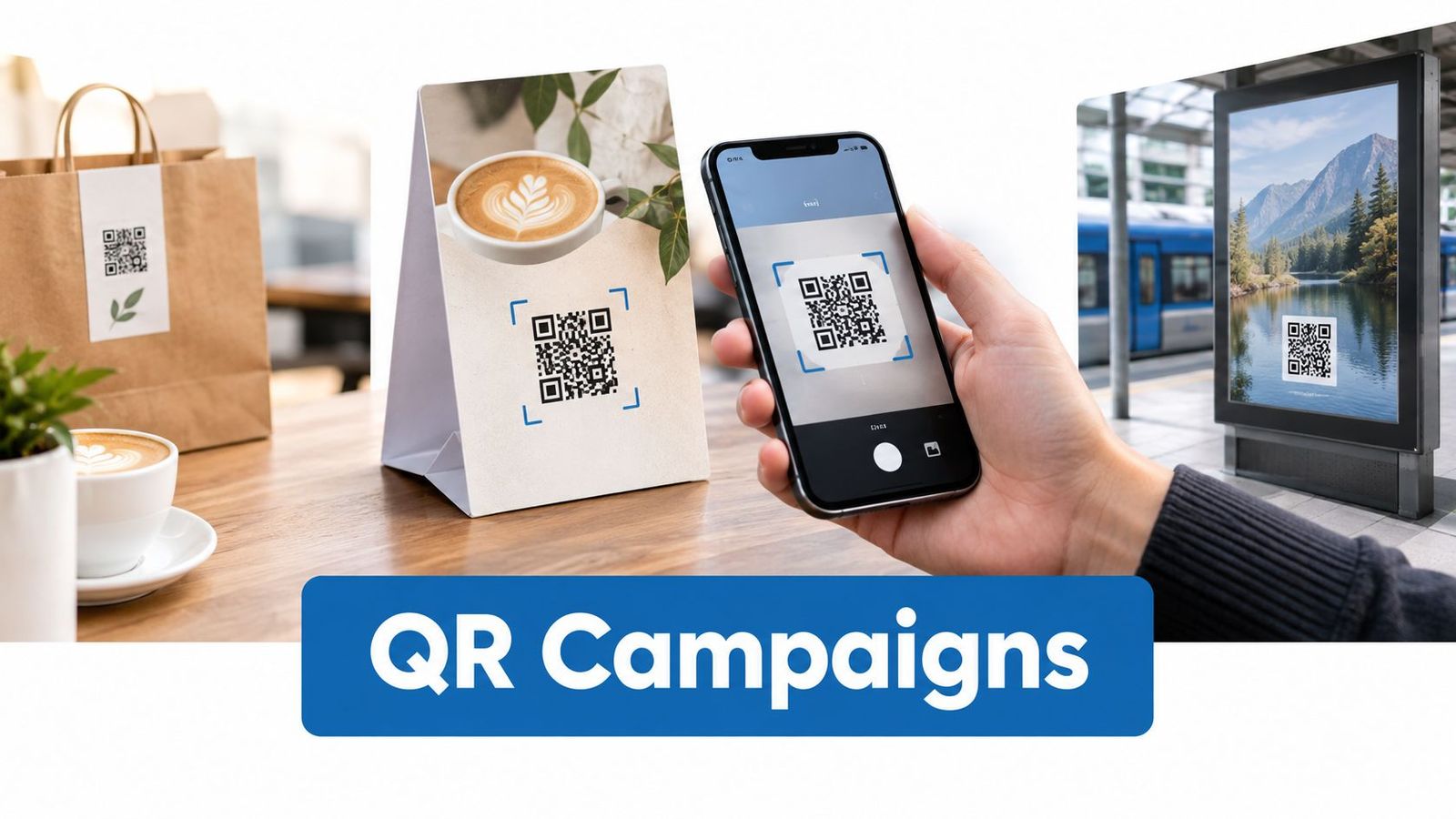
A scan without a reason is just a camera click. A strong QR code call to action tells someone what they'll get, puts that promise where they need it, and sends them directly to the promised result.
Familiarity alone won't solve weak messaging. In the UK, 67% of people have used a QR code to visit a website, according to ElectroIQ's QR code statistics[1]. Your audience may already know how to scan, but they still need a reason to interrupt what they're doing.
Start with the customer's situation, not the available space in your layout. Someone holding an unopened appliance needs setup help. Someone waiting outside a restaurant needs the menu. Neither person needs a mystery link to a general website.
These patterns pair specific wording with the right physical placement and a destination that finishes the job.
1. Scan to Shop Without Visiting a Store#
A virtual storefront works when people can browse a physical display and buy the displayed products on their phones. Think of a grocery display beside a transit waiting area: product photographs attract attention, but the QR code must make ordering feel practical.
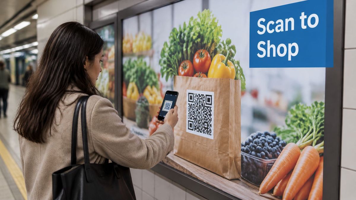
Use Scan to order your weekly groceries rather than a broad invitation to discover the brand. For a smaller display, Scan to shop these products makes the connection between the merchandise and destination explicit.
- Words beside the code: Name the shopping task and, where relevant, explain whether customers can choose delivery or collection.
- Placement at the moment of need: Put the code within comfortable scanning reach beside the products it represents, not across a passageway.
- Destination after scanning: Open the featured collection with current availability, clear prices, and an obvious route to checkout.
Keep the shelf and catalog aligned#
Say a retailer advertises pantry essentials on a station wall. A collection page containing those same products is a better destination than the retailer's homepage, where the shopper must reconstruct the display through search.
Use an editable destination so the printed code can point to a replacement collection when stock changes (see how to change a QR code destination after printing). Don't substitute unrelated merchandise for unavailable items; explain the change and offer relevant alternatives.
Give each placement a distinct tracking path, then compare purchases as well as scans. Test the printed sample and checkout on a constrained mobile connection. A large display can earn attention while still failing commercially if customers can't complete payment before they leave.
2. Scan for a Menu at the Table#
Scan to view the menu and Scan to order and pay describe different experiences. Choose the wording that matches what guests can do, rather than making them discover the limitation after scanning.
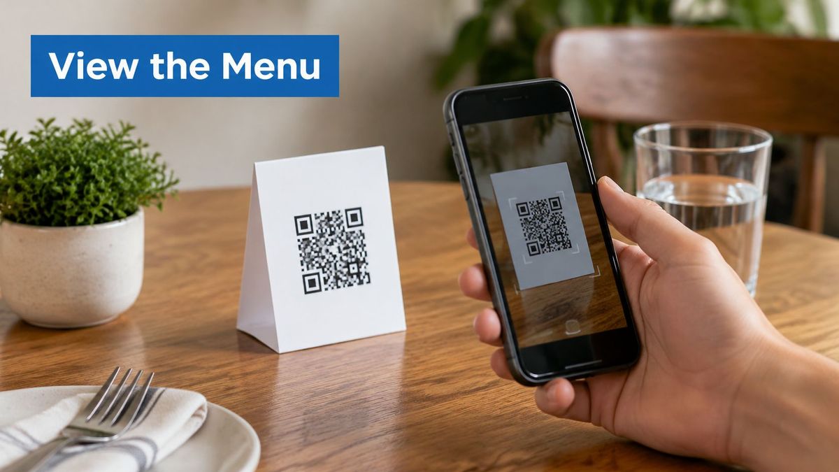
For a café window, place the code where someone can inspect the menu before joining the queue. At a seated restaurant, use a table tent or another stable surface that guests can scan without moving glasses, reaching across companions, or fighting reflections.
Make browsing easier than asking for help#
Send guests to a mobile menu page, not an oversized image that requires repeated pinching and zooming. Show categories, prices, availability, and relevant allergen information clearly. If ordering is available, preserve the correct venue and table context through checkout.
A useful café setup might use Scan for today's food and drinks on the counter and Scan to order another drink at tables. Those prompts address different moments, so they shouldn't automatically share the same opening screen.
- Keep ownership: Use a menu address on your domain so a vendor change doesn't require replacing every table sign.
- Keep content current: Assign someone to update sold-out dishes and seasonal menus.
- Keep a non-phone option: Provide professionally printed menus for hospitality businesses[2] and make them easy to request.
A QR-only menu shifts the work to guests whose batteries, cameras, or connections aren't cooperating. Keep the digital route convenient without making it compulsory. Before launch, have someone unfamiliar with the ordering system complete an ordinary meal order from the printed sign.
3. Scan to Leave a Review After the Service#
A review request belongs near the end of the customer's experience, when they can give informed feedback. On a salon receipt, Scan to review your visit is clearer than a vague request to support the business.
Place the code beside the closing message, away from payment instructions. At a service counter, angle the sign toward customers collecting their order or belongings, rather than people who haven't yet received the service.
The destination should open the correct location's review page. Don't send customers to a corporate homepage, a search result, or a directory of branches they must find themselves.
Separate public reviews from private feedback#
Say an auto repair shop wants both public reviews and detailed service feedback. Use clearly differentiated requests: Scan to review your service for the public platform, and Tell our team about your visit for the private form. Don't disguise one as the other.
Check the review platform's rules before offering incentives or changing the collection flow. Avoid a completion-time promise unless you've tested it across the actual journey, including any sign-in requirements.
Use separate tracking paths for individual locations, but recognize the measurement limit: a scan isn't a submitted review. Where the platform doesn't expose completion data, report scans and review activity separately rather than claiming an exact attribution.
Finally, keep the code off receipt folds and densely printed areas. A well-timed request still fails if thermal printing blurs the symbol or the customer tears it away with the payment slip.
4. Scan to Get an Offer Before Checkout#
An offer CTA needs enough detail for shoppers to decide whether scanning is worthwhile. Scan to claim your welcome discount works only when the surrounding copy explains who qualifies and what they're claiming.
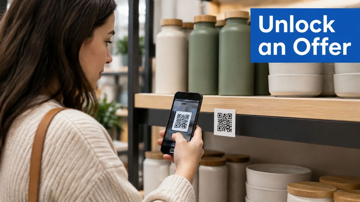
Place an in-store offer where someone can still use it. A shelf tag can influence product selection; a receipt offer usually belongs to the next visit. Don't advertise an immediate discount after the customer has already paid.
Show the deal before requesting data#
The landing page should display the offer, eligibility, redemption instructions, and important exclusions before asking for an email address. If registration is mandatory, disclose that beside the code rather than revealing it after the scan.
The Uniqode State of QR Codes 2026 report[3] found that only 34% of marketers clearly disclose how the data collected through QR codes is used. Be in that group: explain what you're collecting and why instead of treating the scan as blanket permission.
- Match the promise: Send a product-specific promotion to that product's offer, not a general sales page.
- Separate attribution: Give shelf signage, direct mail, and packaging distinct campaign paths.
- Plan the expiry: Replace an expired promotion with a clear explanation and an appropriate next action.
For a practical setup, coordinate your QR code campaigns with the redemption logic you use to build discount codes for DTC[4]. Test eligibility at checkout before approving the print run.
Measure redemptions and completed purchases alongside scans. A curiosity-driven scan followed by an unusable coupon isn't a successful promotion.
5. Scan to Download the App for a Specific Task#
Scan to download our app asks customers to install software. Scan to manage your booking in the app explains why they might bother.
Use the second approach only when the app helps with the task. If customers can complete a simple action on the web, forcing an installation adds an unnecessary obstacle.
A hotel might place Scan to manage your stay on a welcome card. The code belongs beside useful arrival information, and its destination should preserve the property and booking context rather than dropping every guest onto an unrelated app home screen.
- For a new user: Route to the appropriate App Store or Google Play listing.
- For an existing user: Use a supported deep link to open the relevant app screen.
- For an unsupported device: Offer a web route or a clear explanation of available options.
Test installation separately from deep linking#
Operating-system routing and deferred deep linking aren't interchangeable. Sending someone to the right store doesn't guarantee that the app will recover the original task after installation.
Use the guide to redirecting users to the App Store or Google Play by operating system to plan the store-routing layer, then have the app team verify how campaign context survives installation.
Test with the app installed, absent, and signed out. Check supported iOS and Android devices, and verify that campaign parameters reach the intended analytics system.
Judge this CTA by the useful action after installation, not just the store visit. If people install but can't find their booking, loyalty card, or product controls, the journey hasn't delivered what the printed words promised.
6. Scan to Verify What's Inside the Package#
Product-information CTAs work best when they name the question a shopper wants answered. Scan to see where this coffee was grown is more useful than learn more, while Scan to check this product's authenticity makes a much stronger promise.
That distinction matters. A generic brand page can explain sourcing, but it can't establish that the particular item in someone's hand is genuine.
QR codes began in a practical identification setting: DENSO's history[5] records their development in Japan in 1994 to help manufacturing workers identify and track automotive components. Apply that same task-focused thinking to packaging.
Match the code's specificity to the claim#
Place sourcing information near the relevant product description, and keep the code readable without opening or damaging the package. For an authenticity check, show the brand-owned destination in print and explain what the customer will be checking.
- Product information: A shared product page can explain ingredients, care, or sourcing.
- Batch traceability: Use a batch-specific destination when the information differs between production runs.
- Item verification: Use an appropriate verification system rather than treating an ordinary shared URL as proof of authenticity.
A study of Vietnamese supermarket consumers[6] found that perceived usefulness and supply-chain transparency positively influenced intention to use QR codes. Give customers the relevant evidence directly, with clear product identification and an understandable result.
Review QR code security practices alongside the packaging design. A copied code can still open a legitimate page, so avoid claiming that scanning alone proves an item is genuine.
7. Scan to Register Before Joining the Queue#
At an event entrance, attendees need to know whether they're registering, confirming attendance, or collecting access details. Scan to register for this session and Scan to check in shouldn't lead to the same ambiguous form.
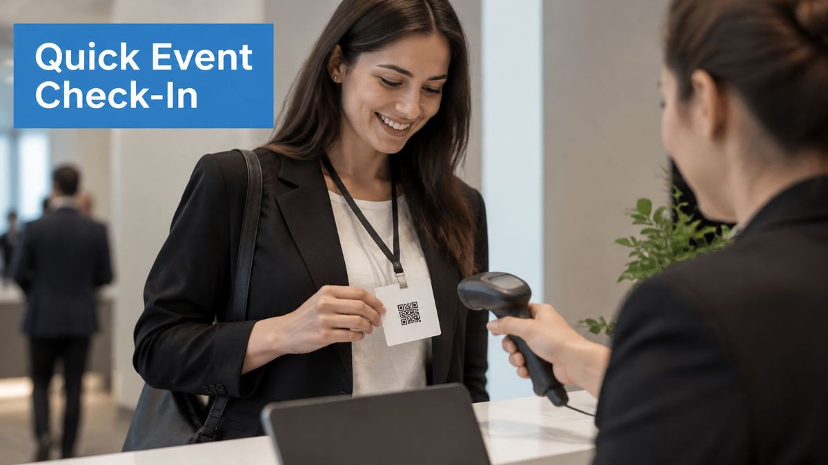
Place self-service registration signs where visitors can stop safely before reaching the staffed desk. A badge that staff scan is a different workflow from a public sign attendees scan themselves; label and test them separately.
Confirm the outcome immediately#
For a conference workshop, use Scan to reserve your workshop place beside the session description. Open a form already tied to that workshop, request only the information needed, and finish with an unmistakable confirmation.
Don't ask attendees to choose the same session again from a long list. If capacity has been reached, explain that before collecting their details and offer a clearly labeled waiting list where appropriate.
- Reduce form work: Ask for attendance information separately from optional marketing preferences.
- Identify the source: Give booth signs and session posters distinct tracking paths.
- Prepare a fallback: Offer staffed check-in and a readable web address when scanning or connectivity fails.
Accessibility belongs in the operational plan. A U.S. Census Bureau usability study[7] found that experienced QR users took an average of 12.4 seconds to scan a code, while explicitly noting that it couldn't evaluate people without prior QR experience.
Don't build a queueing plan around instantaneous scans. Keep the fallback available without making visitors explain a disability or accept a worse registration experience, and distinguish assisted registrations from failed digital journeys in reporting.
8. Scan for Help When Setup Stops#
A customer holding an unfamiliar bracket doesn't need your company story. They need Scan for the assembly guide or Scan to troubleshoot the power light.
Put the code where the problem happens: on a setup card, beside the relevant manual step, or on a durable product label that remains accessible after installation. Don't hide the only help route on packaging the customer will throw away.
For a flat-pack desk, the code beside the drawer-rail diagram should open that assembly stage. Sending the customer to a video library transfers the search work back to someone who is already stuck.
Make help usable without the video#
Open the correct model and product revision, then offer the relevant video with captions, written steps, and clear diagrams. Don't require account creation just to reveal basic setup instructions.
A permanent branded address helps preserve access when the support platform changes. Use an editable destination to move customers to updated guidance, but retain older instructions when hardware differences make them necessary.
- Words beside the code: Describe the task, such as fitting the filter or connecting the remote.
- Placement during use: Check that customers can reach and scan the label without unsafe movement.
- Destination after scanning: Show the answer first, followed by related troubleshooting and contact options.
Keep essential safety instructions in the physical material rather than making them available only through a scan. Test support content with the product in front of you, following the same sequence a new owner would.
Measure whether users reach the relevant answer or request further assistance. A large scan count may indicate useful support, confusing instructions, or a recurring product problem. Investigate the task before declaring the campaign a success.
How each QR code call to action differs by audience, placement and destination#
| Item | Primary Audience | Typical Placement | Ideal Destination | Wording Focus |
|---|---|---|---|---|
| Scan to Shop: Virtual Storefront CTA | Shoppers and commuters | Transit stations, bus stops, airports | Mobile product catalog and checkout | Scan to shop or order |
| Scan for Menu: Contactless Ordering and Information CTA | Restaurant and venue guests | Tables, counters, windows | Mobile-friendly menu, ordering, or reservations | Scan to view the menu |
| Scan to Leave a Review: Feedback and Reputation CTA | Recent customers | Receipts, packaging, checkout counters | Review platform or feedback form | Scan to share your experience |
| Scan to Get an Offer: Coupon and Promotion CTA | Deal-seeking shoppers | Posters, shelf tags, direct mail | Offer landing page or digital coupon | Scan to unlock an offer |
| Scan to Download the App: Deep Link Install CTA | Prospective and existing app users | Print ads, packaging, event materials | Appropriate app store or in-app destination | Scan to download or open the app |
| Scan to Verify: Product Information and Authenticity CTA | Product buyers seeking details or proof | Product packaging, labels, products | Product information, traceability, or authenticity page | Scan to verify or learn about the product |
| Scan to Register: Event Check-In and Sign-Up CTA | Event attendees and prospective participants | Badges, invitations, posters, booths | Registration, check-in, or sign-up form | Scan to register or check in |
| Scan for Help: Support and Instructional Video CTA | Product owners needing assistance | Manuals, appliances, furniture, setup cards | Help page, instructional video, or support form | Scan for help or setup instructions |
Match the Words to the Moment and Measure the Scan#
Every strong QR code call to action answers the same practical questions: who is scanning, what are they doing, and what must the destination deliver immediately? Approve the wording, placement, and landing page together rather than treating the code as a finishing touch in the artwork.
Start with the exact promise. If the sign says view the menu, the menu should be visible on arrival. If the package promises authenticity verification, a brand introduction isn't an acceptable substitute.
How long the redirect behind the scan takes#
A dynamic code adds one redirect between the scan and the page your call to action promised, so its speed is part of what the person holding the phone waits for. In RedirHub’s redirect speed benchmark[8] for 27 October to 3 November 2026, the median time to first byte of a redirect, averaged over Washington, D.C., Frankfurt and Tokyo, was 15 ms for RedirHub, 38 ms for Dub, 115 ms for Bitly and 267 ms for Rebrandly, out of 27 providers measured. That hop comes before the landing page starts loading, which is one more reason to test the full journey on mobile data rather than office Wi-Fi.
Test the printed experience, not just the URL#
Scan a physical proof in the intended lighting and from the position customers will occupy. Check glare, curved packaging, receipt quality, contrast, and the clear space around the code. Keep the CTA close enough that customers can tell which instruction belongs to which symbol. Our guide to QR codes for print covers size, contrast, file formats and the scan test in detail.
Research published in the Journal of Business Research[9] found that creative complexity interacts with consumer curiosity and perceived brand fit in QR-code scan intention. Don't assume a more decorative design will persuade every audience; test visual treatment without sacrificing legibility or a clear benefit.
Apply the principles of persuasive copywriting for better conversions[10] to the promise, not just the headline. Specific wording helps customers decide whether the action is relevant, but the destination still has to justify their decision.
- Compare equivalent placements: Don't attribute a difference in scans to wording when the signs had different visibility or foot traffic.
- Measure the completed task: Track purchases, redemptions, registrations, or successful support journeys where your systems allow it.
- Separate alternative routes: Record typed addresses and assisted completions without treating accessible options as failures.
- Assign ongoing ownership: Name someone responsible for destination checks, expired offers, and changes to printed claims.
Keep the public address on a domain you control and the destination editable. Marketing teams need to update campaigns, while IT and agency teams need stable domain ownership, working HTTPS, and documented routing rules.
An editable destination doesn't make every printed claim evergreen. You can replace a landing page, but you can't change an expired promise already sitting on a shelf. Plan the replacement experience before distributing the asset.
Choose a live placement and trace the complete journey from printed words to finished task. Fix mismatches before testing cleverer copy. The most useful improvement may be a clearer promise, a better-positioned sign, or a destination that finally does exactly what the customer expected.
RedirHub’s dynamic QR codes run on your own domain and are included on Core, Pro and Enterprise. Their destination can change after printing, and the Analytics page shows clicks, unique visitors, QR scans and errors, each compared with the previous period.
Put the promise on a code you can update
Create a dynamic QR code on your own domain, track its scans, and change the page it opens without reprinting the sign.
Create a dynamic QR codeSources
- [1]ElectroIQ: QR Code Statistics By Usage and Facts (2025)
- [2]The Print Warehouse: Menu Printing
- [3]Uniqode: QR Code Statistics 2026: Usage, Trends & Benchmarks
- [4]PlatformDTC: Discounts Promo Codes: How to Build and Run Them on DTC
- [5]DENSO 75th anniversary history
- [6]When do shoppers prefer using QR codes? Empirical evidence from Vietnam (Future Business Journal, 2024)
- [7]U.S. Census Bureau: Usability of Quick Response (QR) Code as a Method to Access a Survey Using a Smartphone
- [8]RedirHub redirect speed benchmark, 27 October to 3 November 2026
- [9]The curious versus the overwhelmed: Factors influencing QR codes scan intention (Journal of Business Research, 2019)
- [10]Silver Spoon Agency: Copywriting in Marketing: A Guide to Words That Sell
Frequently asked questions
It is the short line beside a code that tells people what they get when they scan, such as "Scan to view the menu". A good one names the result, sits where the person needs it, and opens a destination that delivers exactly that promise.
Name the task and its result, for example "Scan to order your weekly groceries", "Scan to review your visit" or "Scan for the assembly guide". Avoid "scan here" or "learn more", and disclose requirements such as registration beside the code rather than after the scan.
Right beside the code, close enough that people can tell which instruction belongs to which symbol, and at the moment of need: the menu at the table, the review request at the end of the service, setup help on a label that stays with the product.
Give each placement its own tracking path and measure the completed task as well as scans: purchases, redemptions, registrations or support answers reached. A scan is not a submitted review or a sale, and only placements with similar visibility show what the wording changed.
Yes, if the code is dynamic: it encodes a stable URL that redirects to the current destination, so the page can change without reprinting. On RedirHub, dynamic QR codes are included on Core, Pro and Enterprise and their destination can change after printing. The printed promise itself cannot change, so plan what an expired offer will open.

Leo Astarothman is the Brand & Content Lead at RedirHub, where he shapes the company's visual identity, educational content, product experiences, and marketing strategies. He also specializes in system design. Simplifying complex redirect infrastructure into practical resources, product experiences, and campaigns that help businesses understand and adopt modern redirect management.
Related Articles
View All Articles